Just like in the realms of fashion or makeup, decoration is an art subject to trends and experts in the field.
Therefore, today we will discover the keys to beautiful color decoration and what considerations to take into account to achieve the desired emotions and impact.
Tips for succeeding with color decoration
The first tip for combining colors successfully is the so-called 60/30/10 rule.
This rule involves choosing a main color that will cover 60% of the space.
In addition, a secondary color should be chosen, which will color 30% of the space; and a third color that will take care of the remaining 10%.
The second tip to keep in mind is that the color norm indicates that opposite colors attract. For example, white and black, white and beige, or even white and blue.


This can be verified on the color chart: if colors are opposite on the wheel, they will combine fantastically.
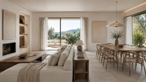
And as a basic third point, you should know that neutral colors always match well together, providing calm and relaxing environments.
They are also a great base for introducing colors without saturation: for example, beige and white, beige and gray, or white and gray.
The color wheel
The color wheel is a circular representation of the colors present in the palette of primary colors (blue, yellow, and red), the secondary colors generated by mixing the primaries (orange, violet, and green), and the tertiary colors that arise from combining primaries and secondaries.

They are divided into warm colors (yellow, orange, red, and pink) and cool colors (blue, purple, and green), as well as achromatic colors (black, gray, and white).
Warm colors convey joy and energy, and cool colors cleanliness and tranquility. In contrast, achromatic colors are used as a base.
To combine colors from the wheel and succeed, here are three keys to always get it right:
Combining complementary colors:
This involves combining the opposite colors on the wheel that we saw earlier. The result of combining them creates a colorful space but without clashes. The system consists of choosing the color you like as a base and looking for its two opposite tones. You can choose completely opposing colors or a more moderate option.
Consecutive colors
This involves combining colors that are next to each other on the color wheel. It’s a harmonious mix and can be three cool or three warm colors mixed together, but they must always be consecutive on the wheel. This technique adds a lot of dynamism to the decoration.
Monochromatic combination
It consists of choosing a color and mixing it with others of the same line, varying the intensity. It’s the simplest option since you decide the color that will dominate the space at 60% and whether it is intense or soft. It’s perfect for rest areas like bedrooms.

Important points for decorating with colors
The number of colors to combine is well defined if you aspire to beautiful and not strident decoration. Professional decorators rarely use more than two colors in a space, or three if one of them is neutral.
Knowing how to play with just two colors can give a perfect result. For this, it’s important to consider that in the decoration of a place, there are details that not only color contributes. We must also think about textiles, accessories, or even the material of the furniture.
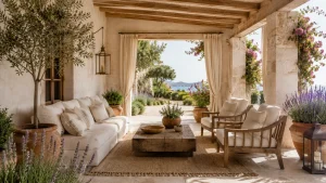
The goal of beautiful color decoration is to achieve a neutral base in any style and bring it to life with color details.

Not all decorative elements look good on the canvas: a splash of color will liven up the environment by breaking the monotony. If you tire of it, you can always repaint it.
Before choosing the shades, it’s crucial to observe the space analytically and focused.
Check the natural light that enters the room, whether it’s a warm or cool room, and take into account the temperature of a room. Cool colors relax, and warm colors excite.
Another virtue when mixing colors is to achieve visual effects:
- Another virtue when mixing colors is to achieve visual effects:
- Mark an area by delimiting it with a rug or wallpaper.
- Camouflage a pillar by making it part of the decoration by painting it the same color.
- Alter the perception of a place by making it seem different through paint.
Color mixes
How to mix them and achieve a space with the desired personality and atmosphere? Take note of these basic rules for attractive color decoration:
Medium tones with white: mixing medium intensity tones with white is a beautiful combination because it does not give a sensation of saturation. White adds brightness and spaciousness.
Medium tones with intense colors: a medium gray can be used as a base, combined with an olive green. It’s a touch that combines very well with wood. It gives a sophisticated and luxurious result, although less luminous than the previous one.
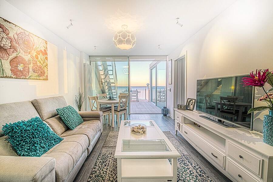
Reds: it’s complicated to introduce red tones in rest areas. It’s a strong color that tends to excite us. The way to place it in a room is by using it as a break in a single piece over soft tones.
Neutral tones: although they have a reputation for being boring, the opposite can be achieved by combining, for example, white with a bluish-gray. They go great with wooden furniture or green floral arrangements.

Black color: we always consider black a dark and gloomy tone, however, it can be used for decoration if you know how to do it. It’s an elegant color that has to be used in the correct amount so as not to darken the room too much. It’s recommended for very bright places.

Pink color: if used poorly, it can create a childish or cheesy atmosphere. However, it can work in any area of the home since it has many different shades. It can bring delicacy and femininity, breaking, for example, a blue base to which a current golden color splash would make good company.
Purples: purples are perhaps the most undervalued colors in the color palette when it comes to using them as a key to beautiful color decoration. Their natural combination is with gray, although they work very well with pinks and greens. And if you are very brave, you can combine them with mustard colors.
With these basic keys for beautiful color decoration, you will achieve a perfect combination for any space you want to renovate or decorate from scratch.
Remember that color plays a very important role in the atmosphere we create for each space, so do not forget to have the color scale in mind, you will surely succeed.